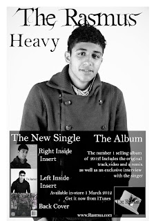
As a group we had 2 choices whether we wanted to do individual work or if we wanted to do the evaluation together using final cut pro. We were told that we had 2 weeks to plan and finish our evaluation as we then came to a conclusion that we wanted to do the evaluation sepratley. We took many things into consideration as we were deciding which way to do a conclusion.
If we did it together using Final cut pro we could only use it in college hours because we do not have it anywhere else and our timetables were very different which wouldnt allow us to go in the editing sweet together for most of the time. However deciding the individual work we would be able to work on our evaluations at home on any computer which would give us more time to work on our evaluations to make it a good standard.
Tuesday, 26 February 2013
Tuesday, 5 February 2013
Survey
Click here to take survey
this is our survey that we have created, in this survey we have asked many different types of questions whether our whole 3 products work well as a package or not. we have asked open questions so that we can get different ranges of answers as the respondants would be able to write anything they think about our whole package whether if it works or not.
this is our survey that we have created, in this survey we have asked many different types of questions whether our whole 3 products work well as a package or not. we have asked open questions so that we can get different ranges of answers as the respondants would be able to write anything they think about our whole package whether if it works or not.
Monday, 4 February 2013
first insert inside the CD cover
Back Cover
This is the back cover of our CD package as we have chosen a dark effect to connote the feelings within the music. The second one is our final version.
Magazine Advert Construction
Here we where playing around with the texts, colour and image to see what would make it look more appealing and unconventional.
Subscribe to:
Comments (Atom)


